Field Types
FormTab has a great selection of field types to allow you to build powerful forms.
Basic
Text
A simple input for small amounts of text. Settings
- Required
Optional/Required - Hidden
Visible/Hidden - User Input
Normal/Read OnlyUse when the text field is populated by a CSV or Live Data List - Placeholder
Placeholder text to display in an empty field - Default Value
Value to pre-fill the field with - Multi-Line
Allow more than a single line of text entry. Limited to 200 characters.For larger blocks of text, use a Text Area
Text Area
A large text box to support big blocks of text. Settings
- Required
Optional/Required - Hidden
Visible/Hidden - User Input
Normal/Read OnlyUse when the text field is populated by a CSV or Live Data List
Number
A field for inputting numbers. On iOS devices, it displays the number keyboard for text entry.
By default, any input is accepted. If the field is set to Required the input must be a valid number.
Settings
- Required
Optional/Required - Hidden
Visible/Hidden - User Input
Normal/Read OnlyUse when the text field is populated by a CSV or Live Data List - Default Value
Value to pre-fill the field with
A field for inputting email addresses. On iOS devices, it displays the email keyboard for text entry along with a button that allows you to choose a contact form the device's Address Book.
By default, any input is accepted. If the field is set to Required the input must be a valid email format.
Settings
- Required
Optional/Required - Hidden
Visible/Hidden - User Input
Normal/Read OnlyUse when the text field is populated by a CSV or Live Data List - Default Value
Value to pre-fill the field with
URL
A field for inputting website addresses/URLs. On iOS devices, it displays the website keyboard for text entry.
By default, any input is accepted. If the field is set to Required the input must be a valid URL format.
Settings
- Required
Optional/Required - Hidden
Visible/Hidden - User Input
Normal/Read OnlyUse when the text field is populated by a CSV or Live Data List - Default Value
Value to pre-fill the field with
Date
A field for inputting dates using the device's native input widget. You can optionally require times as well.
Settings
- Required
Optional/Required - Hidden
Visible/Hidden - Show Time
Yes/No- Minute Interval
Show minutes in 1/5/10/15/30 intervals
- Minute Interval
TIP
Check out Using the Date Field for more on Date fields.
Lists/Selections
Checkbox
A simple checkbox. This is displayed using the device's native input widget.
Settings
- Required
Optional/Required - Hidden
Visible/Hidden
Segmented
A radio button equivalent, allowing the user to choose from a short list of options. You can define between 2 & 5 options and each option has a maximum character limit (if you require more options, use a Select list).
You can also colour-code the options to allow for Traffic Light style forms.
Settings
- Required
Optional/Required - Hidden
Visible/Hidden - Options
Define up to 5 options. Option sets can be saved as a preset for repeated use.
TIP
Check out Colour-coded Segmented Fields.
Select
Allows selecting a value from a list of pre-defined options. Can be defined as either a single or multi-select list.
For a more advanced list, consider using a CSV List.
Settings
- Required
Optional/Required - Hidden
Visible/Hidden - Multi-Select
Yes/No - Options
Define a list of options. Set a default value. Option sets can be saved as a preset for repeated use.
Slider
Allows selecting a number value from range using the device's native input widget.
Settings
- Required
Optional/Required - Hidden
Visible/Hidden - Minimum Value
Lowest value possible - Maximum Value
Highest value possible - Default Value
Intial value of the field
Media
Photo
A field that allows the user to choose a photo. When using FormTab on a mobile device the user also has the option to take a photo with the device's camera.
Settings
- Required
Optional/Required - Hidden
Visible/Hidden - Gallery
Yes/No. When Yes, the user can select up to 6 photos
Signature
A field that allows the user to provide a digital signature. When using FormTab on a mobile device the user signs with their finger on the screen. When using FormTab in a web browser the user can sign with the mouse or upload a file.
Settings
- Required
Optional/Required - Hidden
Visible/Hidden
Sketch
A field that allows the user to draw on a canvas. A photo can be selected as background making it possible to annotate or markup an image. When using FormTab on a mobile device the user also has the option to take a photo with the device's camera.
Settings
- Required
Optional/Required - Hidden
Visible/Hidden - Gallery
Yes/No. When Yes, the user can add up to 6 sketches
Barcode
A field that allows the user to scan a barcode/QR code using their device's camera. A wide range of common code types are supported. Also allows manual entry of a barcode number if the code isn't recognised or the device doesn't have a camera.
Settings
- Required
Optional/Required - Hidden
Visible/Hidden
Location
Location (GPS)
A field that allows the user to select a location on a map. The user can either use their current location or drop a pin. The location is saved as a lat/lon coordinate.
Settings
- Required
Optional/Required - Hidden
Visible/Hidden
Address
A field that allows the user to enter an address. The field contains a button which attempts to identify the street address of the user's current location. In the event that this fails, a manual address can be entered.
Settings
- Required
Optional/Required - Hidden
Visible/Hidden
Advanced
Table
Allows a group of fields to be defined as columns in a table. When filling the form the user can add as many rows as required.
Settings
- Required
Optional/Required
TIP
Check out How To Use Tables.
CSV List
A field that allows a user to select a value from a list of options provided by an uploaded CSV file.
CSV Lists have a number of advantages over a normal Select field:
- While Select list options are stored as part of the form, CSV Advanced Lists are stored in the cloud
- This allows you to use the same list across many forms
- Any changes you make to the list will update for your users automatically, without having to edit & re-publish the form
- CSV Lists can include additional data columns which can be used to auto-populate other fields
For list of dynamically generated values, consider using a Live Data List.
CSV Lists are cached when using the mobile app, allowing for offline use.
Settings
- Required
Optional/Required - Hidden
Visible/Hidden - CSV List
Upload a file, or choose an existing list
TIP
Check out the CSV Lists Reference.
Live Data List
A field that allows you to use third-party data as a source for your list. This allows you to integrate with your existing systems to provide up-to-date data in your forms. Live Data Lists have the following features:
- Data is stored in the cloud
- The same list can be shared across many forms
- Form values can be sent when requesting the list, allowing for dynamically generated results
- Live Data Lists can include additional data columns which can be used to auto-populate other fields
Settings
- Required
Optional/Required - Hidden
Visible/Hidden - Live Data List
Provide a valid, public URL to the data source, or choose an existing list - Form Fields
Send values from the nominated fields when requesting the list. This allows the result to be dynamically generated
Live Data Lists are cached when using the mobile app, allowing for offline use where possible.
TIP
Check out the Live Data List Reference.
Calculations
Sum
A read-only field that displays the sum of number values. The values to be added are defined in the Calculation Builder. Numbers in the calculation can be:
- The value of a Number/Slider/Calculation field
- Statically defined
Settings
- Required
Optional/Required - Hidden
Visible/Hidden - Calculation Builder
Define the fields/values to be used in this calculation - Format
Default/Whole Number/Decimal/Currency
TIP
Check out the Calculations Guide.
Arithmetic
A read-only field that displays the result of a calculation. The calculation is defined in the Calculation Builder. Numbers in the calculation can be:
- The value of a Number/Slider/Calculation field
- Statically defined
Settings
- Required
Optional/Required - Hidden
Visible/Hidden - Calculation Builder
Define the fields/values/operators to be used in this calculation - Format
Default/Whole Number/Decimal/Currency
TIP
Check out the Calculations Guide.
Timeframe
A read-only field that displays the the difference between two dates. The dates can be either:
- The value of a Date field
- Statically defined
- The current date
Settings
- Required
Optional/Required - Hidden
Visible/Hidden - Start Date
The first date in the comparison - End Date
The second date in the comparison - Format
Hours:Minutes/Total Days/Total Hours/Total Minutes
TIP
Check out the Calculations Guide.
Percentage
A read-only field that displays one number divided by another, expressed as a percentage. The numbers can be either:
- The value of a Number/Slider/Calculation field
- Statically defined
Settings
- Required
Optional/Required - Hidden
Visible/Hidden - First Number
The number to divide - Second Number
The number to divide by - Format
Default/Whole Number/Decimal
TIP
Check out the Calculations Guide.
Form Layout
Form Layout items allow you to break up a large form, making it easier to read and fill in. There are options for adding additional text, images or dividers.
Heading
Inserts a large heading between two fields.
Settings
- Heading
The text to display
Text Block
Inserts a block of standard sized text between two fields.
Settings
- Text Block
The text to display
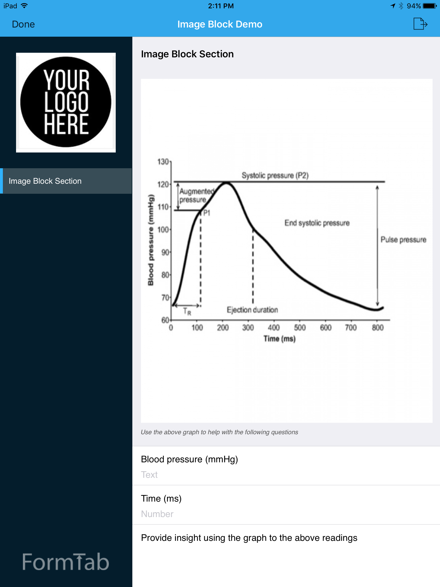
Image Block
Image Blocks allow you to add read-only images to the Form that are visible to the user. They are extremely useful for:
- Providing additional inline information to the user (guides, diagrams, matrices etc)
- Branding
Instructions
Inserts a block of small text between two fields. Ideal for instructions or comments.
Settings
- Instructions
The text to display
Divider
Inserts a vertical space between two fields